Foc i Cor. Social inclusion through cooking.
Case study
Project details
- Client
- Cesal NGO
- Year
- 2026
- Role
- Design and development
- Standard
- WCAG 2.2 level AA
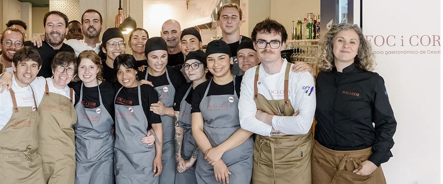
Foc i Cor is the training restaurant run by the NGO Cesal in Catarroja, one of the towns hit hardest by the 2024 floods in Valencia. Its aim: to train more than a hundred people at risk of exclusion as cooks, waiting staff and bar staff by April 2027.
The challenge
Foc i Cor isn’t just a restaurant with a website. It’s a social project that also happens to feed people. And that posed two challenges from the start.
Telling the whole story without losing focus.
It’s a hospitality business, a vocational school for people at risk of exclusion and a way of bringing local trade back to life. If the website only tells one of those three stories, the other two disappear. For the project to be sustainable, the restaurant has to work as the way in: drawing people in and making everything else possible.
Leaving no one out, online too.
If Foc i Cor exists so that no one is left out, its website had to follow the same principle. The conversation with Cesal didn’t start with regulations, but with consistency.
Design decisions
People before plates.
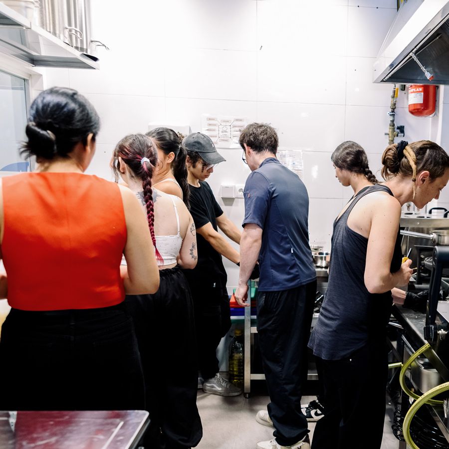
Foc i Cor doesn’t just serve food: it teaches a trade. The website presents its three pillars: market cooking, commitment to l’Horta Sud and training in a real working environment.
An accessible identity.
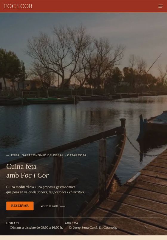
The brand arrived with its own palette. We didn’t change it: we extended it with higher contrast variants for text and interactive elements. The identity stays; legibility improves.
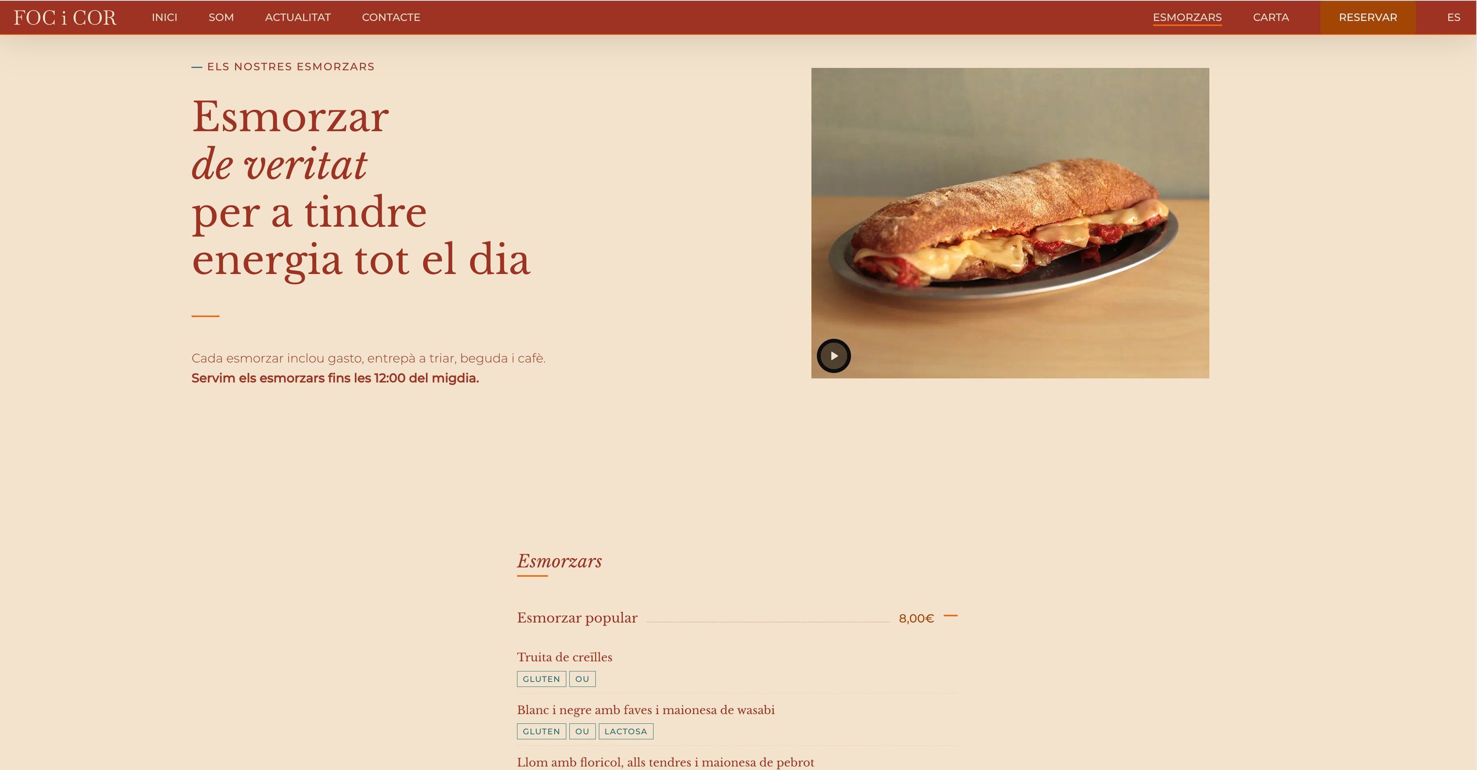
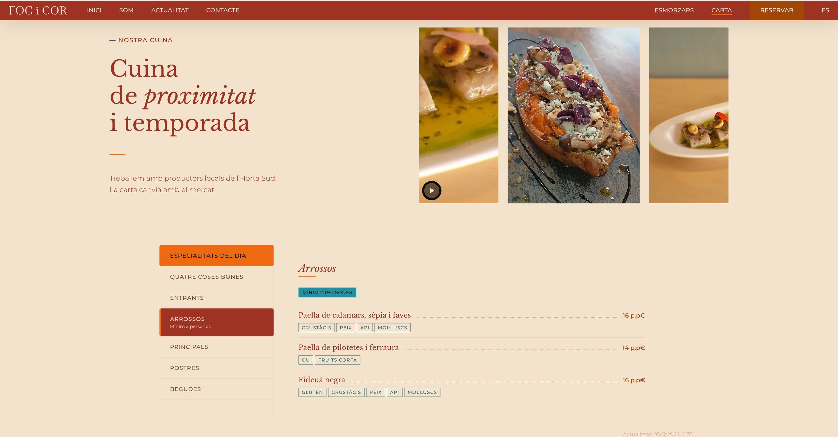
A menu that updates itself.
The team changes dishes and prices in a spreadsheet and the website reflects it instantly. No PDFs, from any device.