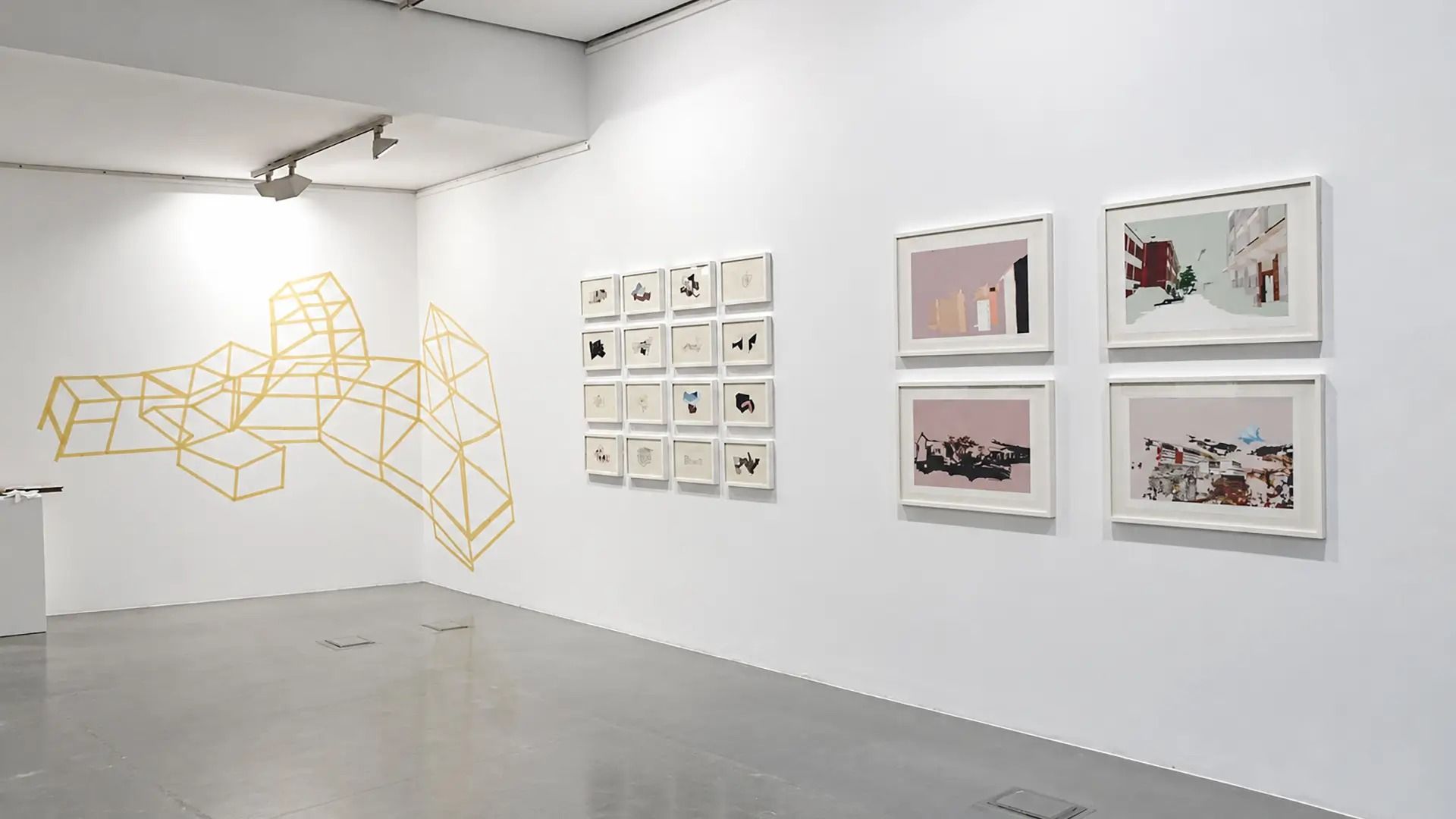
Making room for the work.
Izaskun Etxebarria · Case study
Project details
- Client
- Izaskun Etxebarria
- Year
- 2026
- Role
- Design and development
- Standard
- WCAG 2.2 level AA
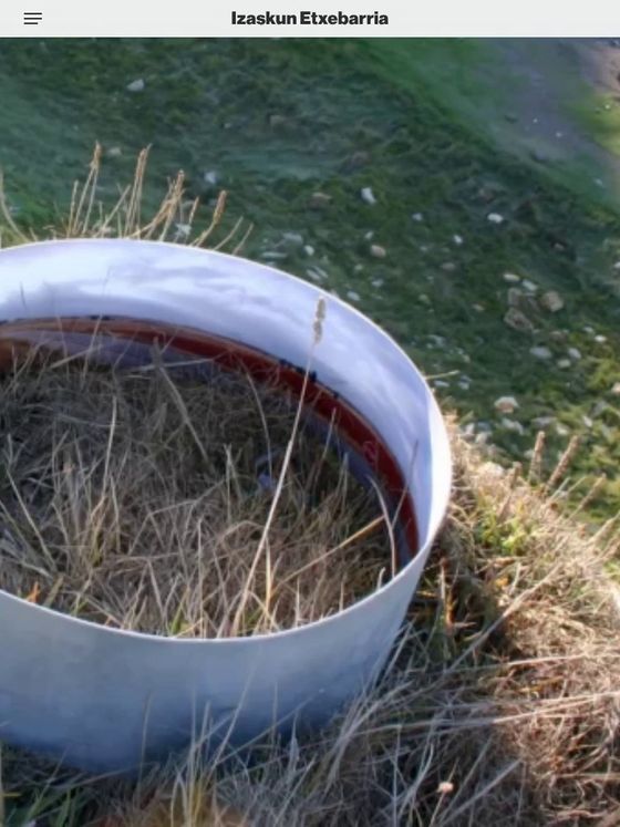
The project
Izaskun Etxebarria is an artist and curator. Her work moves between installation and drawing, in a practice where material, space and gesture carry as much weight as the image itself.
The challenge
Supporting the work.
The website had to do two things at once: support a highly visual body of work and bring order to her projects, exhibitions and writing, while respecting the character of each piece.
Presence.
The work needed space, scale and silence. The interface had to step back while still showing the way.
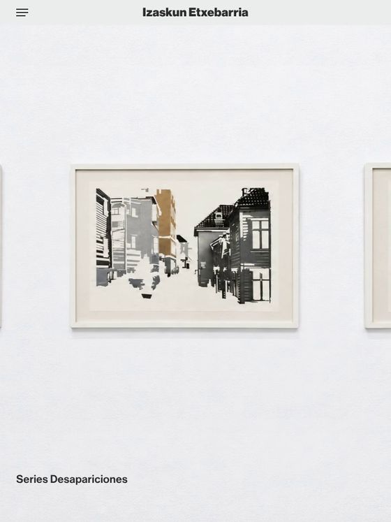
The structure
A complex practice, without oversimplifying it.
Works, exhibitions and writing had to be explorable without losing the character of the project.
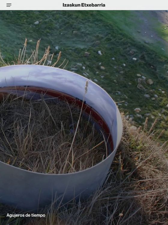
Each series is navigated as what it is: a whole, not a set of loose images. In “Agujeros de tiempo”, the panoramas move from side to side with the pointer.
Design decisions
The project was built on a simple idea: less interface, so the work has more presence.
A restrained editorial structure.
Typography, margins and hierarchy are there to organise, not to decorate. Everything sits on a strongly defined twelve-column grid.
Images first.
Some pieces span the full width and others enter into dialogue with the text, creating a rhythm closer to a publication than to a conventional portfolio website.
Direct, predictable navigation.
Few options, clear paths and an architecture that lets you move through the work without losing your bearings.
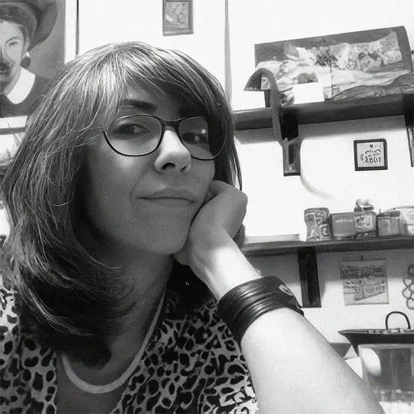
From the other side
“Johnny Vigas and I are close friends, and that trust was the foundation of the whole process. We started out thinking about a website that would bring together everything I have done over my life, but our conversations led us to something far more essential: recognising myself as an artist again.
Johnny has a remarkable ability to listen, to see the other person in a positive light and to discover their strengths, while also attending to the fears that come up along the way. His sensitivity and his connection with the art world made possible a website that is intimate, minimal, transparent and reflective. It is not a record of my career, but a space where people can get to know me first as an artist and then as everything else.”