Elogio de la línea
Pau Jordà. Architect. Case study
Project details
- Client
- Pau Jordà, architect
- Year
- 2026
- Role
- Design and development
- Standard
- WCAG 2.2 level AA
The project
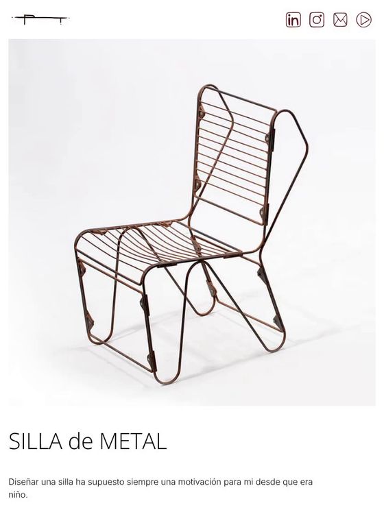
Elogio de la línea is the portfolio of the architect Pau Jordà. A single line writes the name, draws eleven projects and invites you through each page, which moves horizontally and reads just as well with a keyboard, zoomed in or on a phone.
- One line
- writes the name and draws every project
- 11 projects
- in design, architecture and construction, each with its own journey
- 1,024 px
- below that width, or when zoomed in, the website reads vertically
The challenge
A line that never leaves the paper.
Pau didn’t want a portfolio with a grid of thumbnails. He wanted the website to look like the way he works: a line that never leaves the paper. And that posed two challenges.
A website you look at like a drawing.
The horizontal navigation, the opening video and the illustrations are the idea behind the project, not decoration. Removing them to keep things simple would have meant losing it.
And one you can explore in every way.
A horizontal journey tends to break with a keyboard, with zoom or on a small screen. Here it had to work with all of them, without anyone noticing a separate mode.
Design decisions
The whole project comes from one gesture: a line that draws without lifting.
It all comes from one line.
The logo, the icons, the thumbnails and the video are all traced with the same gesture. The home page is not a grid: the projects float like loose drawings on a blank sheet.
The video is the home page.
In 2:42 the line writes “Elogio de la línea” and turns into each project. It starts without sound, can be paused and comes with a text description. If the system asks for less motion, it doesn’t start on its own.
Each project, a journey.
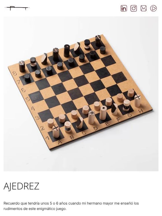
Pages move horizontally, like an exhibition: photo, text, sketches. The images move slightly more slowly than the text, like planes at different distances.
Horizontal only when it fits.
The strip switches on from 1,024 px wide and 600 px high. With heavy zoom, large text or on a phone, the same page reads vertically. Below that it scrolls as usual, so the keyboard stays in charge.