1.4.3 Text contrast
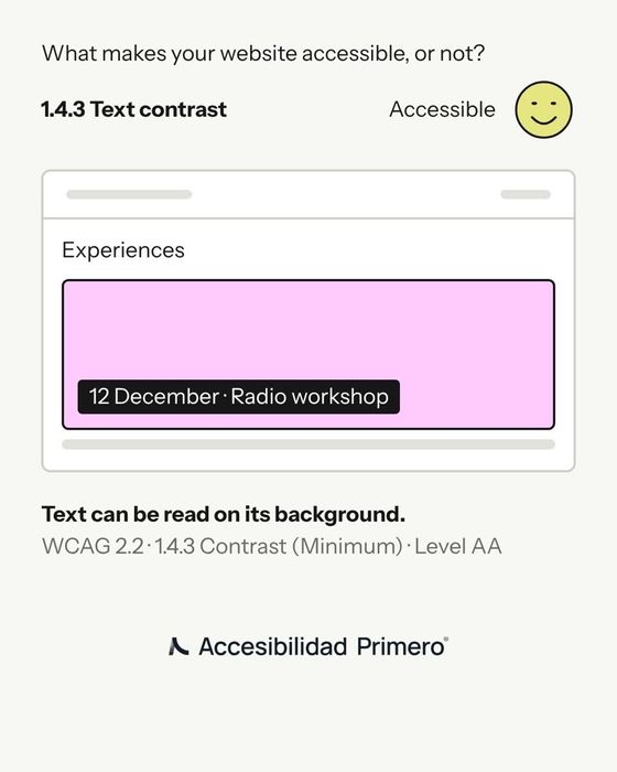
Text can be read on its background.
WCAG 2.2 · 1.4.3 Contrast (Minimum) · Level AA
What goes wrong
The date and name of each event are in white on pink and on light green: a contrast of 1.4 to 1. With low vision, sunlight on the screen or an old phone, the text disappears.
How to fix it
The text sits on a dark label and reads as white on black. WCAG asks for at least 4.5 to 1 for normal text and 3 to 1 for large text.
How to check it
Measure every text and background pair with a contrast checker, such as the Colour Contrast Analyser or the one in your browser’s developer tools. Watch out for text on photos or gradients: measure at the lightest point.
Does your website meet this point? We check it, along with all the others, in an audit.
See the accessibility audit