Understand what fails and how to improve it.
A11y Primero · Case study
Project details
- Product
- Chrome extension
- Year
- 2026
- Role
- Development
- Standard
- WCAG 2.2 A/AA
- Status
- Under review
The project
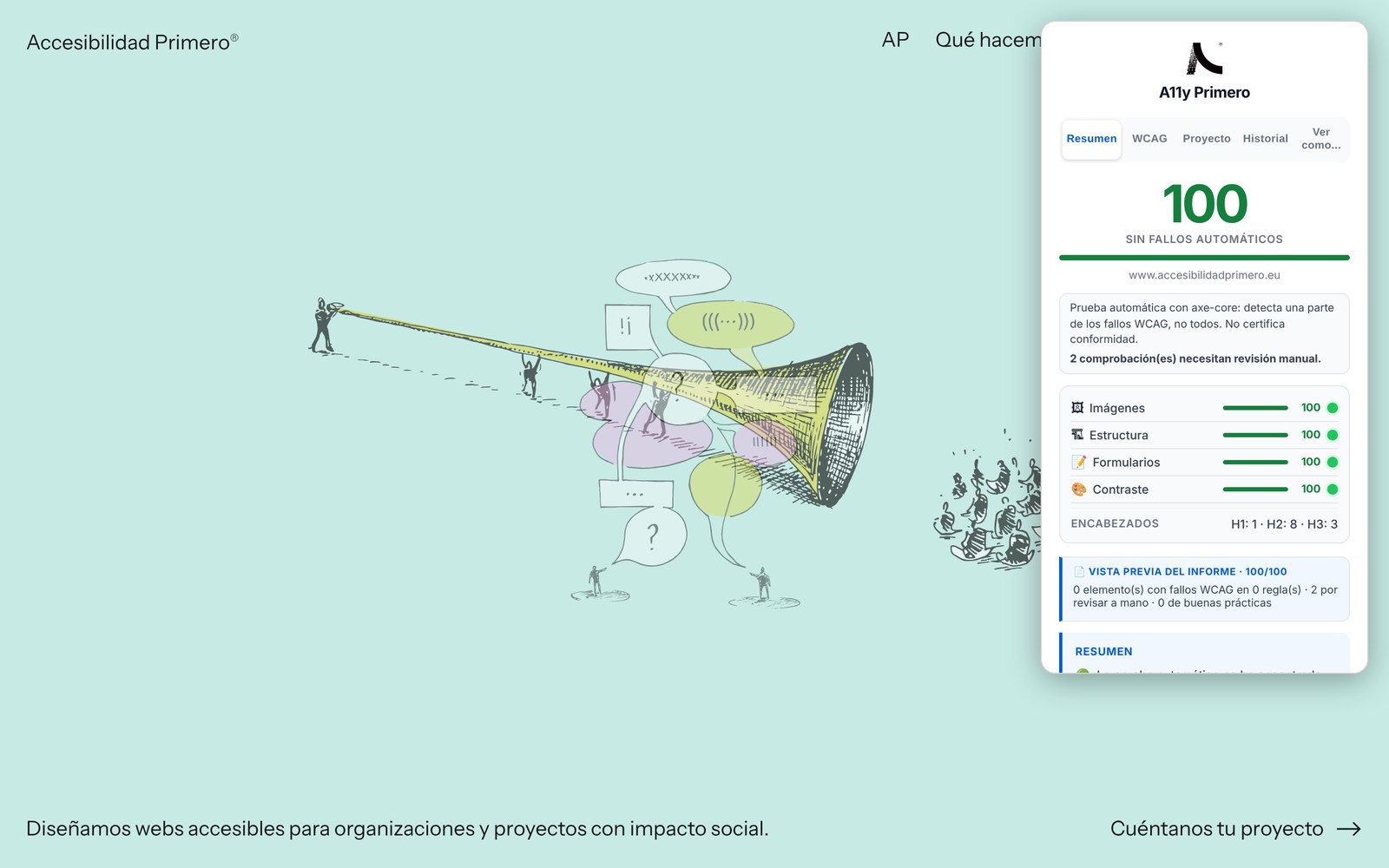
A11y Primero is a Chrome extension that checks a page’s accessibility in one click, using axe-core and the WCAG 2.2 criteria.
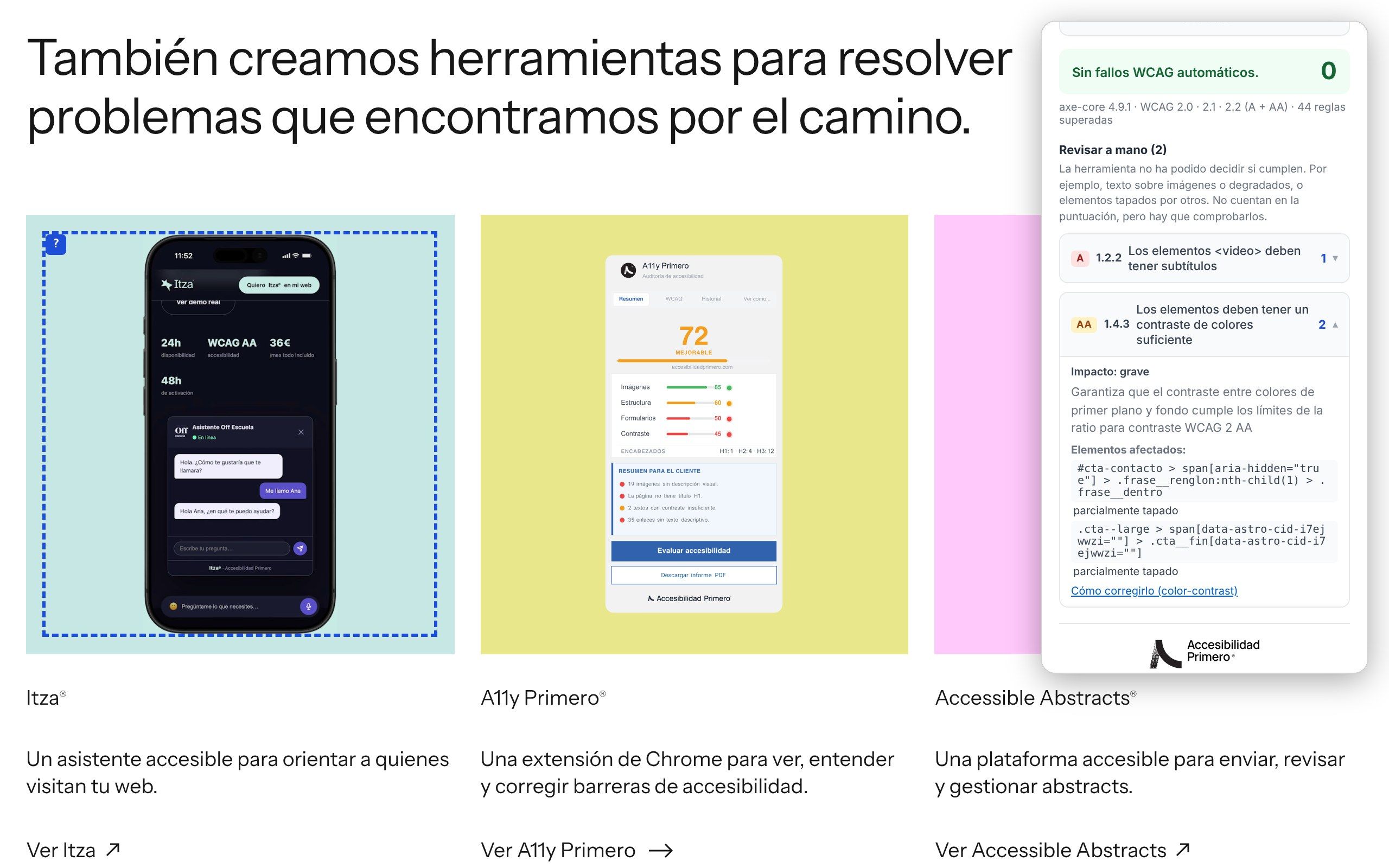
We built it for our own work: it’s the tool we start every one of the studio’s audits with. And we’ve made it ready for anyone who wants to know where to begin with their website.
The screenshots on this page show the extension evaluating this very website, in its Spanish version.
It can’t be installed yet: it’s under review in the Chrome Web Store. If you’d like to try it sooner, get in touch.
I’d like to try A11y Primero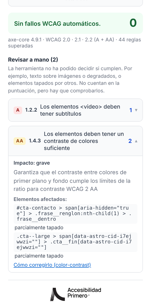
The challenge
One evaluation, two ways to understand it.
A result full of jargon doesn’t explain what’s happening, who it affects or why it’s worth fixing. And for whoever works on the code, knowing there’s a problem isn’t enough: they need to find it, know which criterion it affects and how to fix it.
For those who decide and those who fix.
Every finding is told both ways. “Images must have alt text” is what the person deciding reads; “1.1.1, image-alt, level A” and the selector for each image are what the person fixing it needs.
The structure
Five tabs, from data to report.
“Summary” gives a score from 0 to 100 and the results by category. “WCAG” gives the technical detail of each failure, with the affected elements highlighted on the page itself.
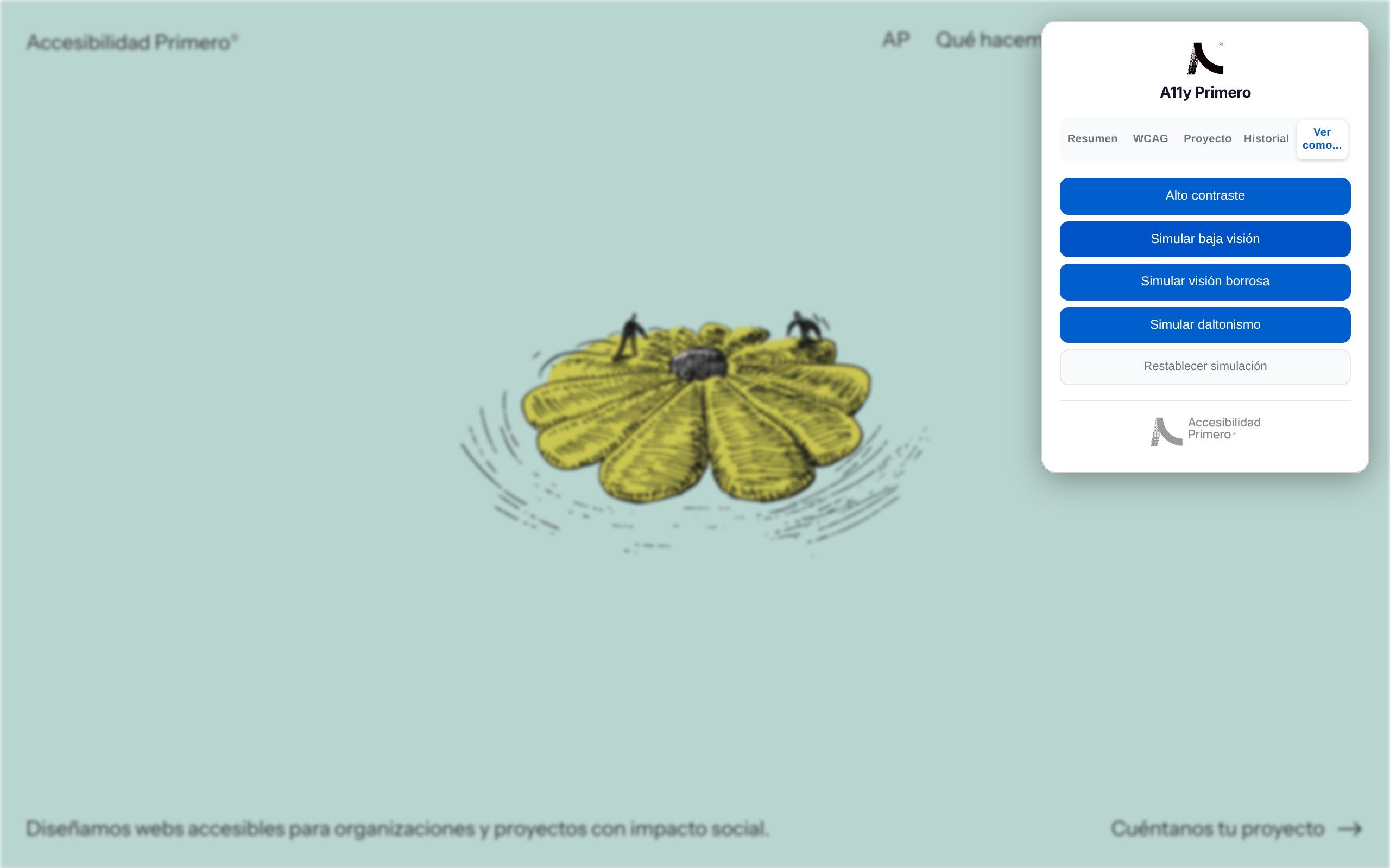
“Project” evaluates several pages of the same site and exports a combined report, because the home page can come out clean and the menu page not. “History” compares the last three evaluations for each domain. And “View as…” simulates low vision, blurred vision, colour blindness and high contrast on the page.
It all ends up in a report: PDF to share and Markdown to paste into a ticket or a repository.
Design decisions
An automated test catches roughly a third of barriers. The tool doesn’t solve accessibility: it helps you know where to start. Every decision comes from that.
A 100 is not a seal of approval.
The score always comes with what the test couldn’t check. Anything the tool can’t decide, such as text over a photo, is set aside to be checked by hand instead of making up a number.
A score you can explain.
It starts at 100 and every failing rule subtracts according to its impact: critical 10, serious 7, moderate 3 and minor 1. Best practices and anything to check by hand don’t subtract.
The data stays in the browser.
No sign-up and no external servers. The extension only reads the tab it’s opened in, and only when you press “Evaluate”, and the report is generated on your own computer.
In three languages.
The interface is in Spanish, Catalan and English, depending on Chrome’s language.